CollectiveJuncture
This is an exhibition, at the Wexford Arts Centre, of some of the work of the 2013 graduating class on the Wexford Campus School of Art and Design. The School is part of Carlow IT, and the exhibits are part of the students' final portfolios for their BA Fine Arts Honours degree.
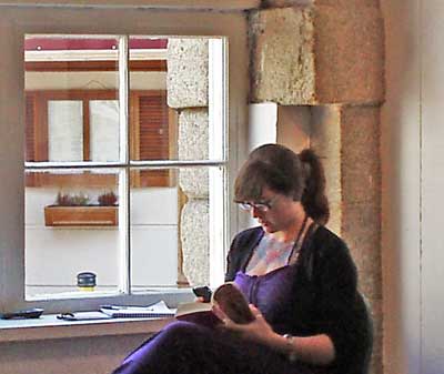
When I wandered in this morning, Annie Gebauer (above) was on duty. She is one of the students whose exhibits are on display, but because these students have been studying together, and cooperating in the staging of the exhibition, she was able to bring me through her fellow students exhibits.
She told me that their lecturers were acknowledged artists in their own right, and that the emphasis has been on contemporary art, which she explained was very much intended to express engagement with the community and also highlight the artist's own issues, whether in the social or psychological area or otherwise.
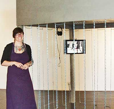
So we started with Annie's own exhibit - kickboxing. This was a square 3D structure in the middle of the floor, with hanging chains which you had to negotiate to enter, and, once inside, you had two computer screens running videos of the local kickbox training sessions. Annie is interested in testing the limits of bodily endurance, in both sexes. Kickboxing was a lifesaver at a particularly low point in her life.
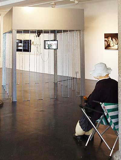
Her exhibit is sort of based on a boxing ring, but she didn't want to use a straight representation. The space she has created here is an interesting one. Adults are slow to enter it, as though they were invading a private space, while the young take to it like a duck to water.
The title of her exhibit "Der Weg is das Ziel" literally means the way is the goal. Shades of better to travel than to arrive and The Way less Travelled.
I was conscious all the time of the presence of this old lady, whose legs were swollen and whose face was disintgrating. She was part of another exhibit and we'll come to her in a moment. For now she will just provide us with a little continuity.
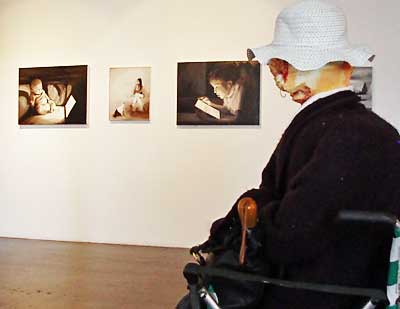
The pictures on the wall are Colette Murphy's exhibit which explores the unrelenting power of internet access on family relations and the passivity with which technology is accepted in a domestic setting. From a distance the pictures look like photos but close up you can see they are paintings.
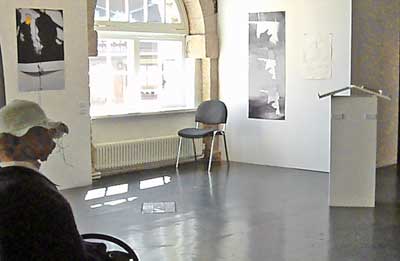
Susanne Seedig's exhibit is very striking. There are a number of interrelated elements in it which need to be seen as a whole and, unfortunately, the layout of the exhibition area is broken by the window. I didn't realise, until a second visit, that all these items were part of the same exhibit.
The title of the exhibit is "Wissen Wir Was Wir Wollen" (Do we know what we want?). Her general preoccupation is with making sense of all the conflicting signs and directions which face us in the course of daily living. In this particular exhibit she is concentrating on the example of the driver, the road, and the bloodstained end to the story. (Position of exhibit elements referred to below are relative to the photo above.)
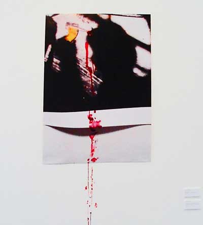
This is the picture on the wall at the left of the general view above. It is the result of an accident (I think) with the blood dripping right out of the picture down to floor level.
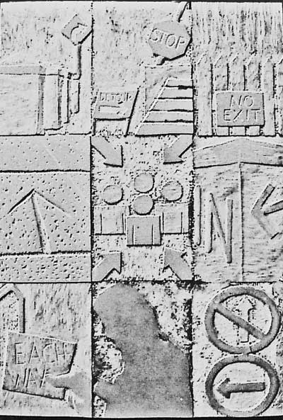
This is the plaque on the floor. It is made up of a variety of conflicting signs.
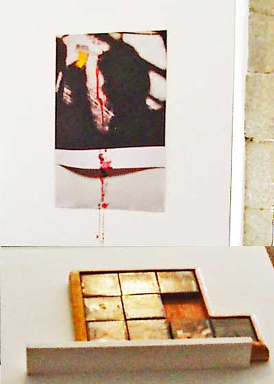
This is a view of the accident on the left from behind the lectern on the right. Here the signs are in the form of one of those shift around block puzzles.
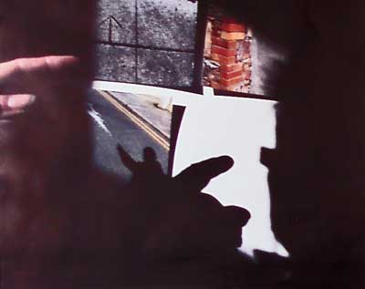
And finally, a detail from the picture on the right of the general view. The postmortem on the accident (I think).
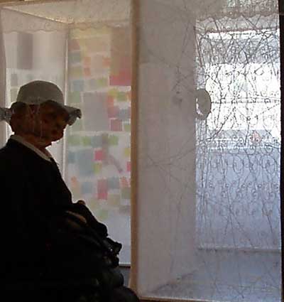
And now to Louise Treacy's old lady and the rest of her. She's advancing in years and sort of coming apart. She is very forgetful and the brain is not generally working very well. What you see over there is the inside of her house (or maybe her brain) which she has difficulty negotiating and which is plastered with memo notes of one sort or another.
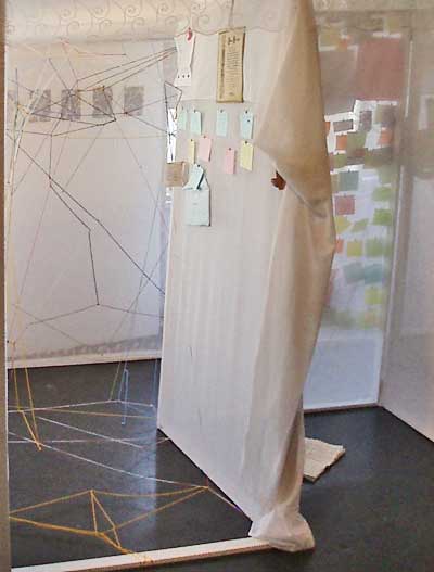
Let's take a closer look. And watch out for the cross-threads from floor to ceiling, and make sure to read all the notes and do something about them.
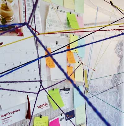
Do I hear a cry for help?
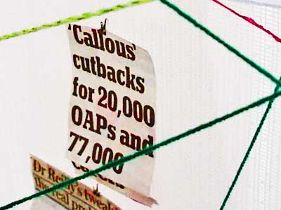
And do watch out for the political sting in the tail.
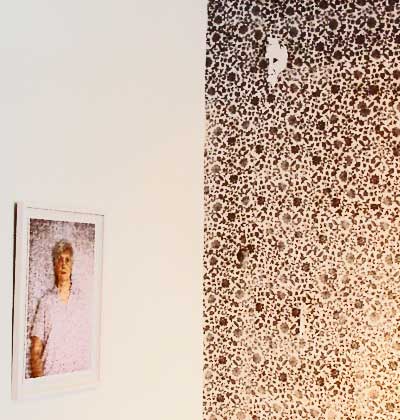
And while we're on the old folk, this is Teresa O Leary's exhibit. Once valued members of society, the old are now gradually binned. Like old soldiers, they may not die, but only fade away. The theme here is the old effectively fading into the wallpaper, to become unnoticed and irrelevant. It is a striking reminder of the life cycle but also of the hastening of the demise of the old in an accelerating and heedless world .
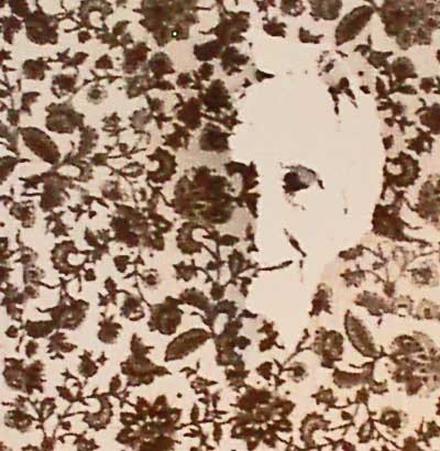 A pretty graphic image. This half face is slowly melting into the wallpaper. And there are a whole lot of other disturbing images on this big wall of wallpaper.
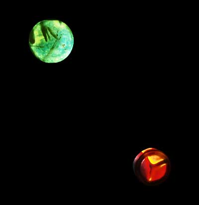
In case you need a short break from all this disturbingly emotional stuff, here is a section of Anne Marie Gerardi's exhibit. She's interested in the relationship between science and the everyday world. These are not planets, they are more like petrie dishes where you can watch the movement of weird shapes at the cellular level.
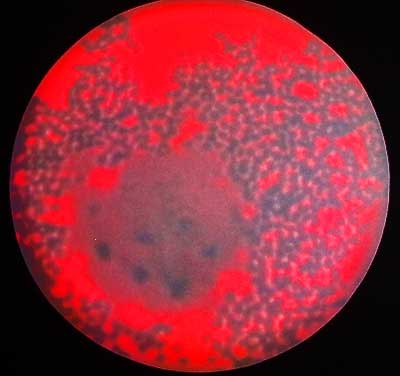
And, in case your own sight is going, here's a bigger one.
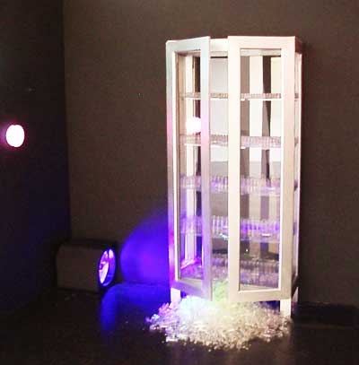
And if you want to go back into scary mode, this is the cabinet where the bugs are stored and I think they are starting to make a run for it.
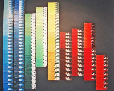
The background to Catherine Healy's exhibit is her own hearing disability. She is exploring the role of repetition and colour and relying on non-sound clues, like parts of faces. And the whole work is in the form of a sound wave. She has been advised to put more reliance on Photoshop but she prefers physically cutting and pasting, painting and photocopying to achieve her effect.
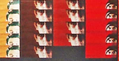
This is a detail of the sound wave.
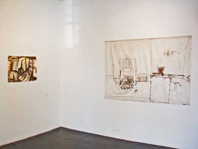
Jane Brown is preoccupied with abandonment. Not the old sort, like Gallarus oratory or the ruined cottages dotted around the country. She is more interested in the recent abandonment of homes arising out of the current economic crises. There are two distinct styles in this exhibit. The larger of the two is both drawn and ironed on fabric,and the smaller is an ink and watercolour painting.
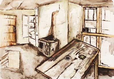
Both are striking in their own way, but it was the smaller painting which grabbed me.
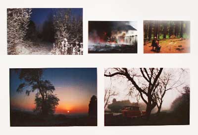
Martin Crosbie has a beautiful set of photos on show. The composition is very good but what really strikes you are the beautiful colour tones. I should really have taken a larger shot of one of them but you'll just have to take my word for it.
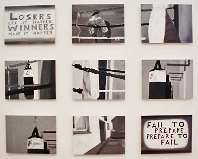
Nicola Giltrap concentrates here on illustrating the primitive facilities available to some boxing clubs. Presumably the sort of thing Katie Taylor had to put up with for years.
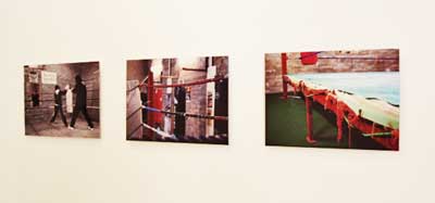
While her first interest was in painting, as in the first shot above, she has now become interested in photography.
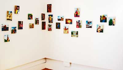
Jacqui Devereux is trying to brighten up your life with postcards from all those places you've never been.
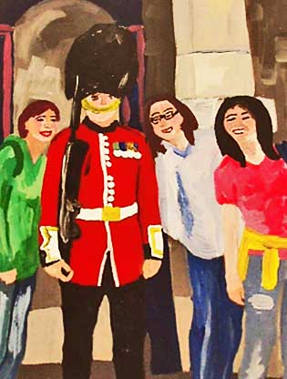
These are done in acrylic. I have selected just two, of places where I have been. London ...
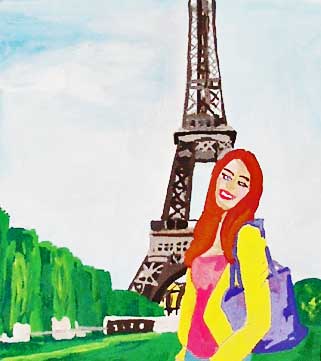
... and Paris
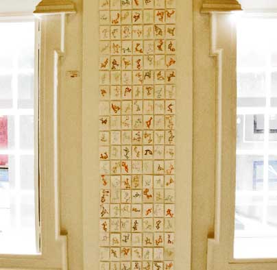
Ruth Berry is trying to make sense of life through geometric shapes.
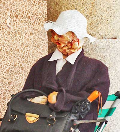
And finally, a last close up look at the old lady who has been looking over my shoulder all the while and to whom I nearly spoke on more than one occasion. I wonder should I have left her a little post-it note to say I had been there?
This exhibition is quite an experience and would restore your faith in the relevance of art for the future.
Here's wishing the students success in their finals
For a preliminary look at the 2014 exhibition check out here.